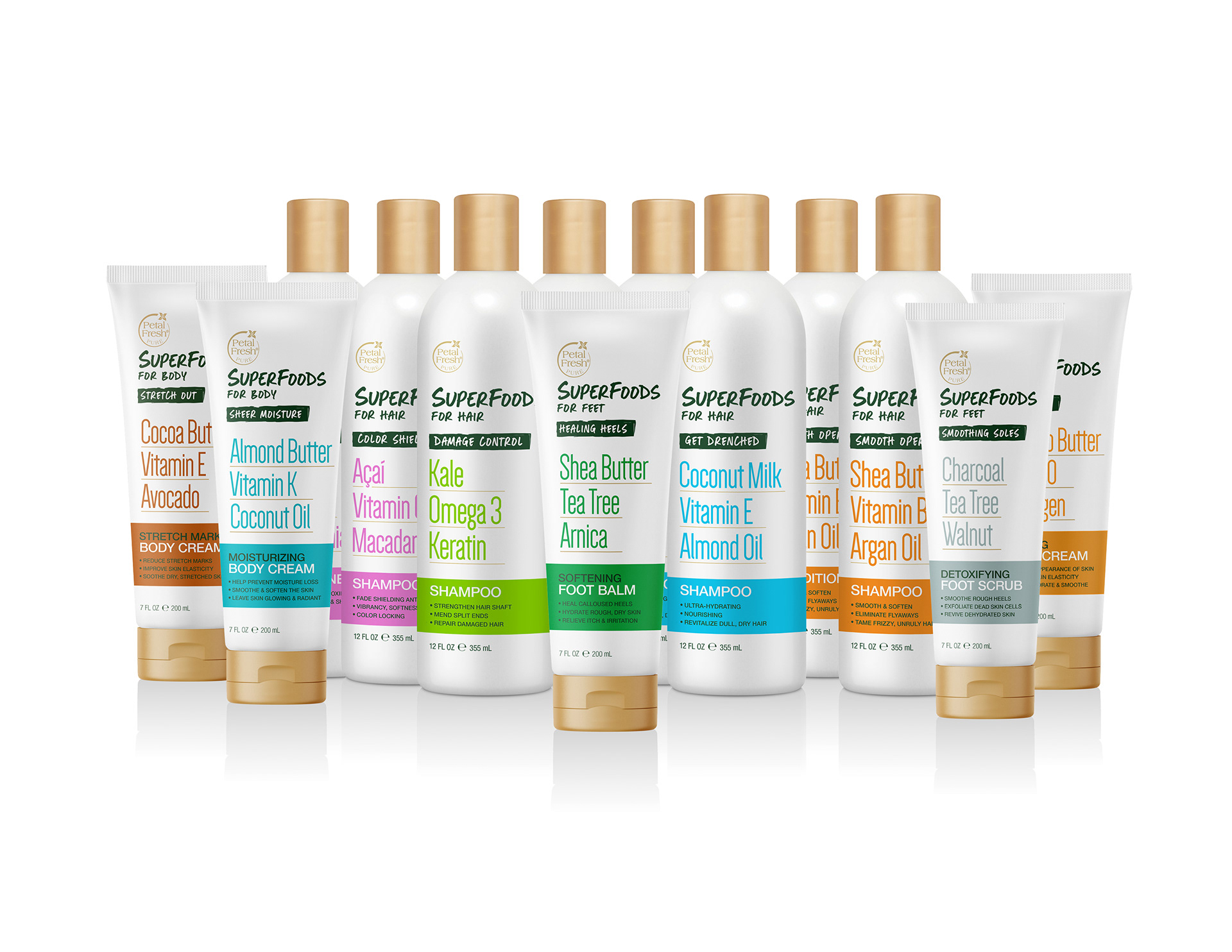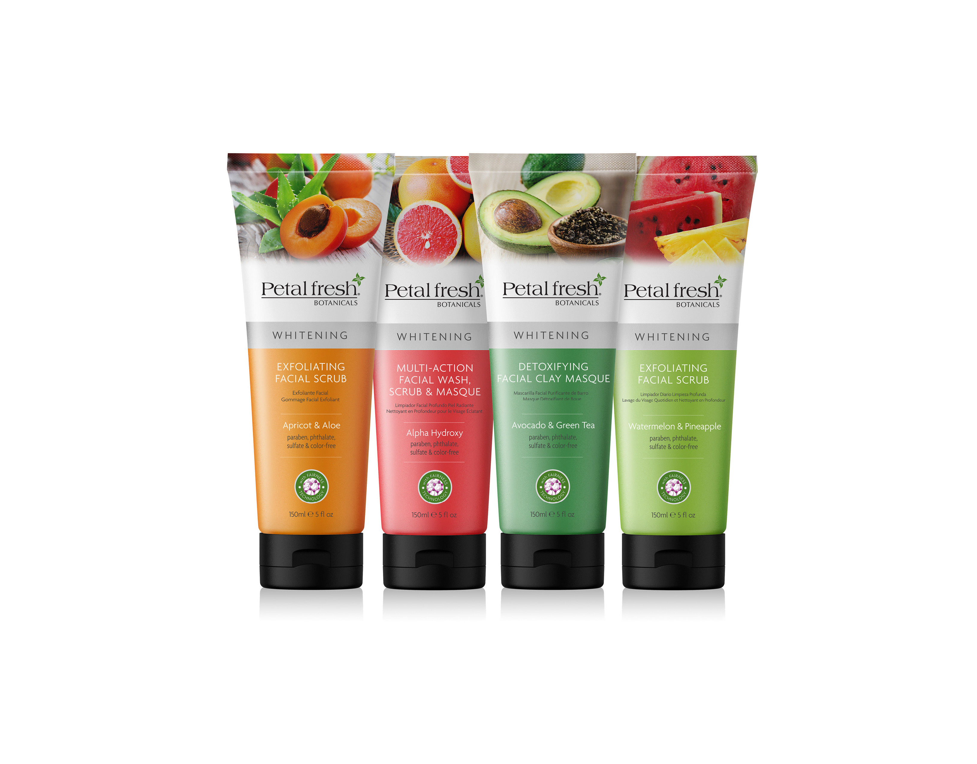
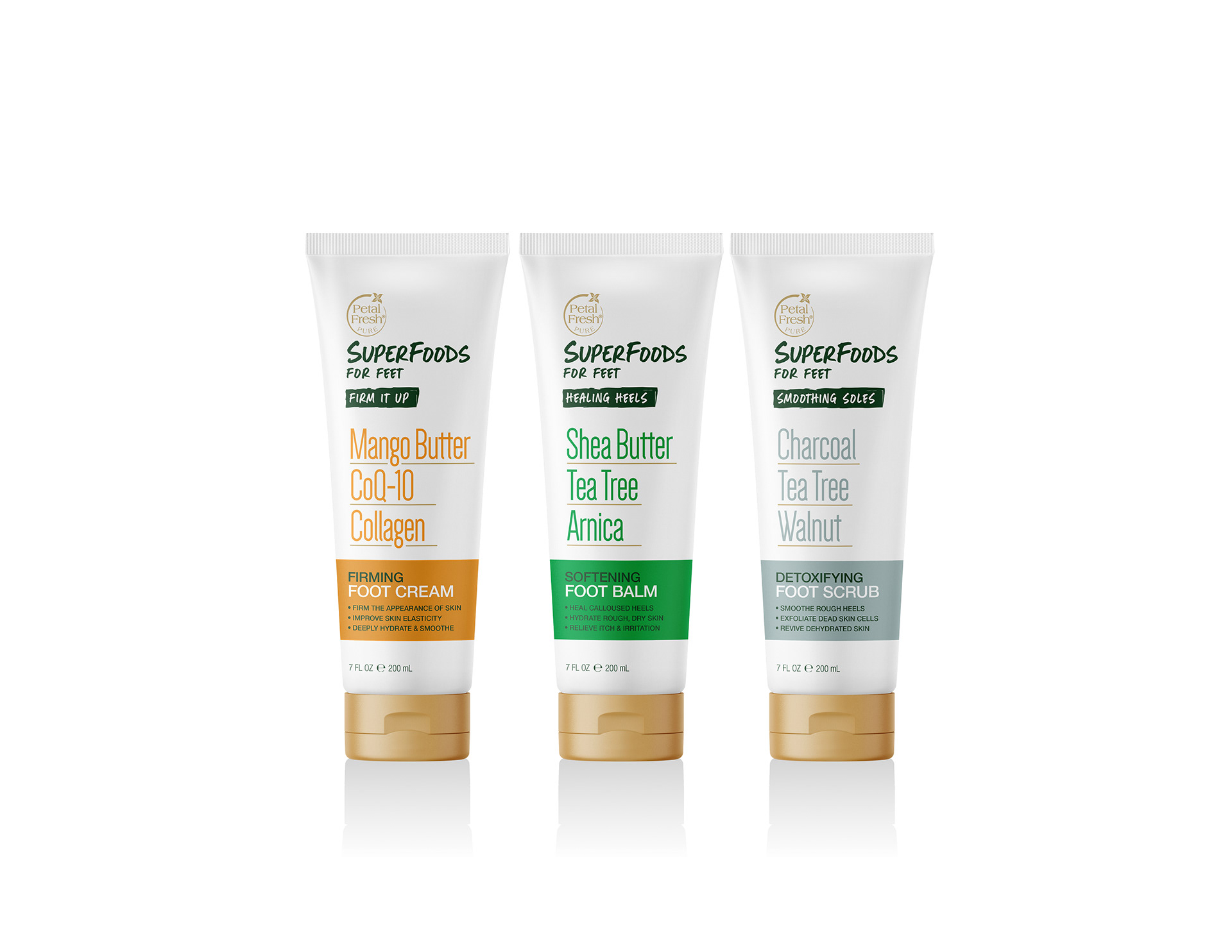
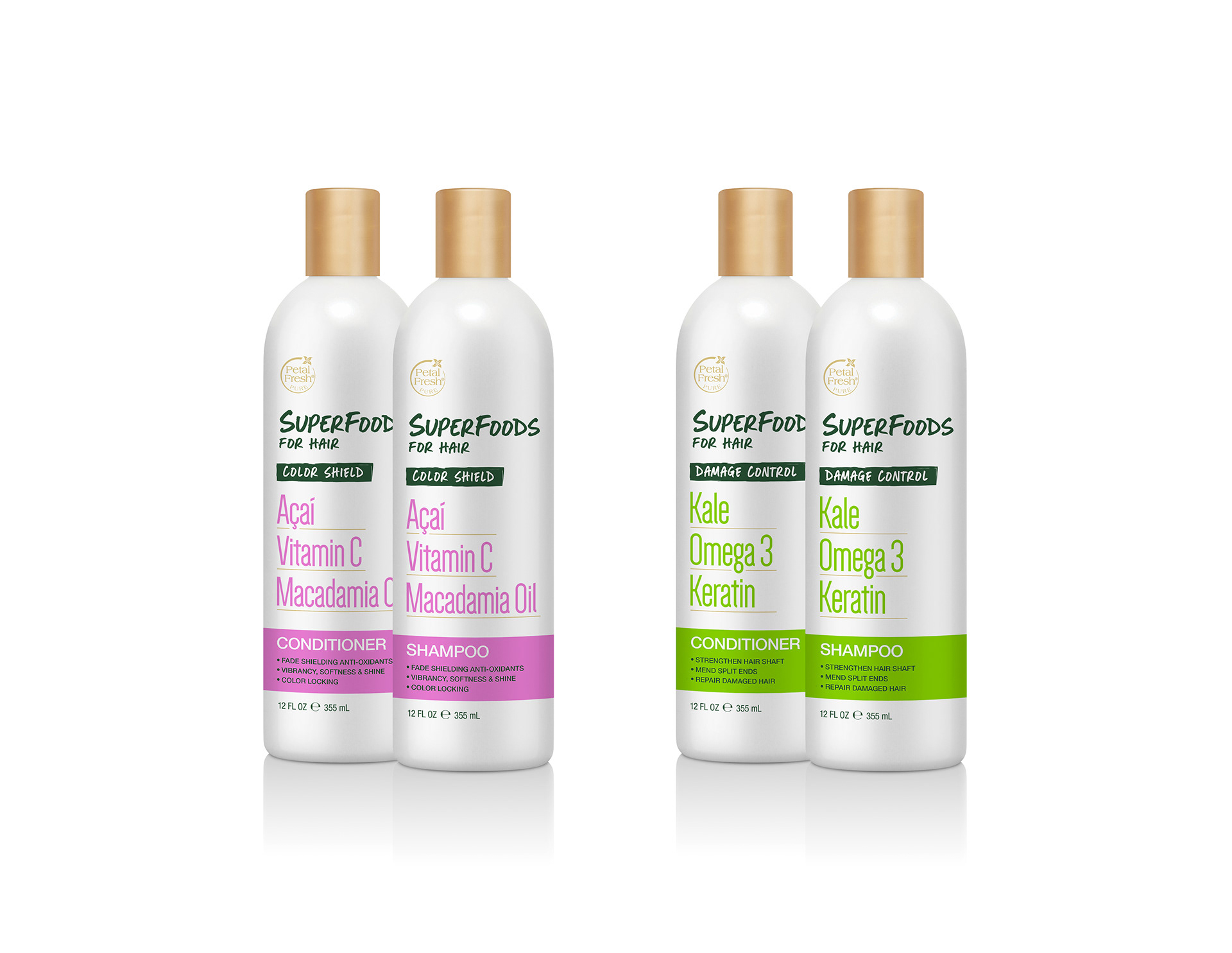
Petal Fresh Pure needed a line extension that could capture a growing consumer segment: shoppers gravitating toward food-forward beauty, where ingredients you recognize from the kitchen carry real credibility on the shelf. I was tasked with developing a cohesive packaging system across four sub-categories -- Hair, Body, Bath, and Feet -- while making on-trend superfoods and functional supplements the clear hero of every SKU.
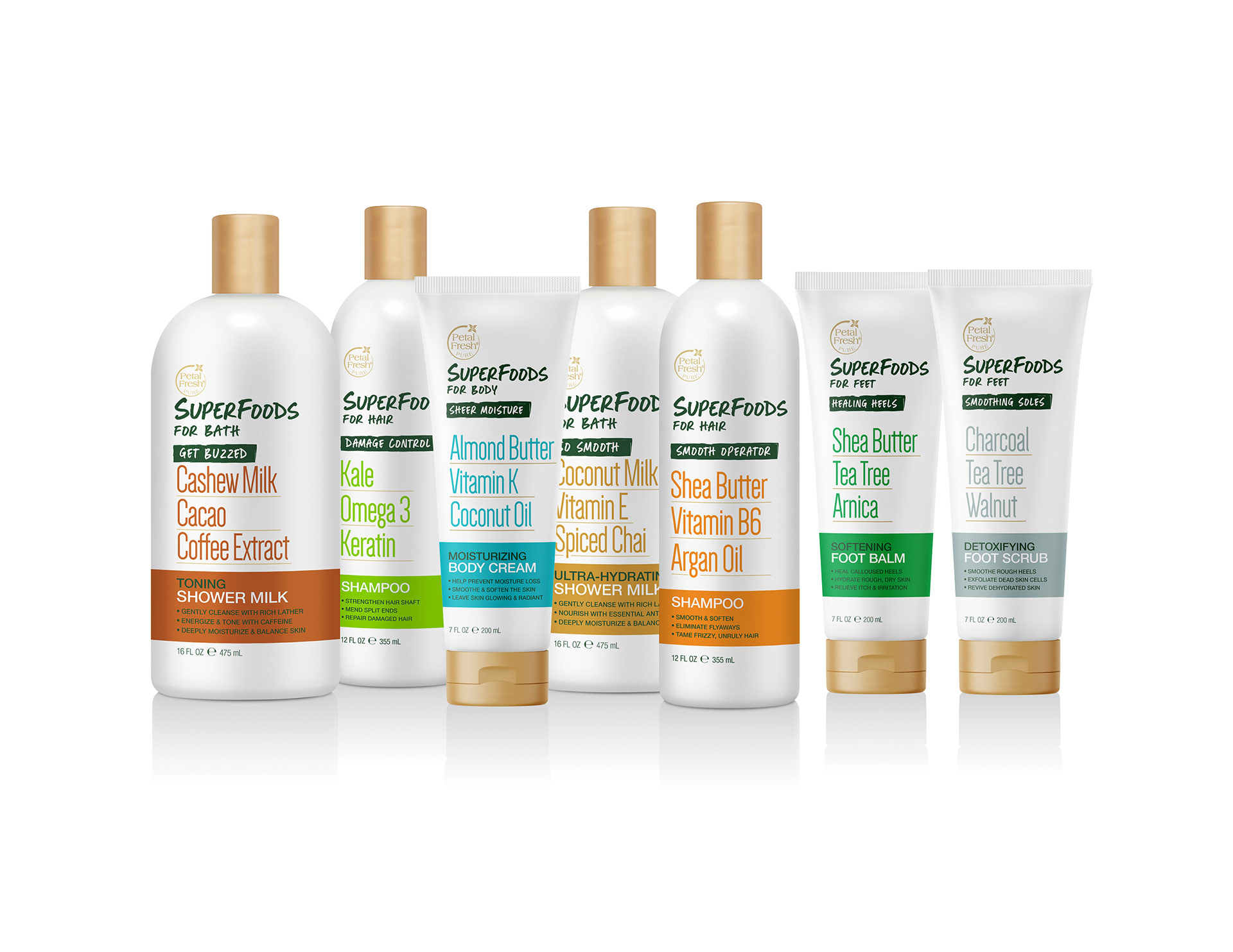
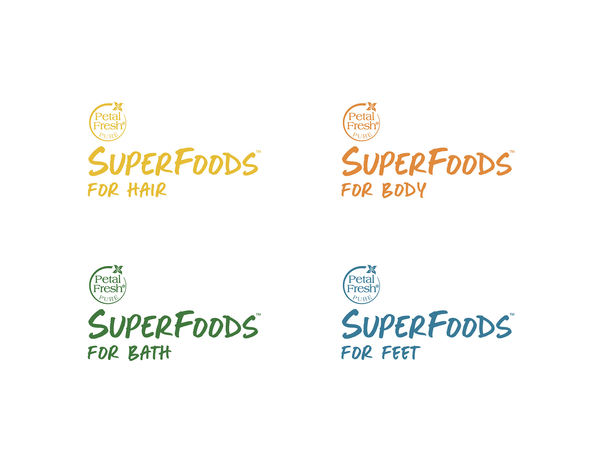
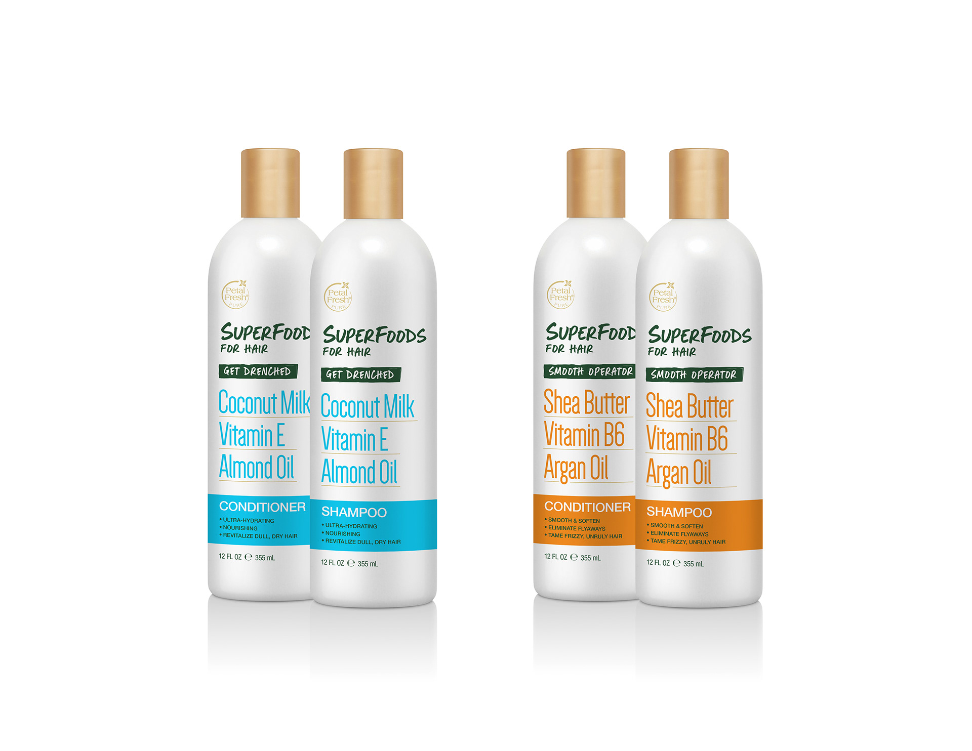
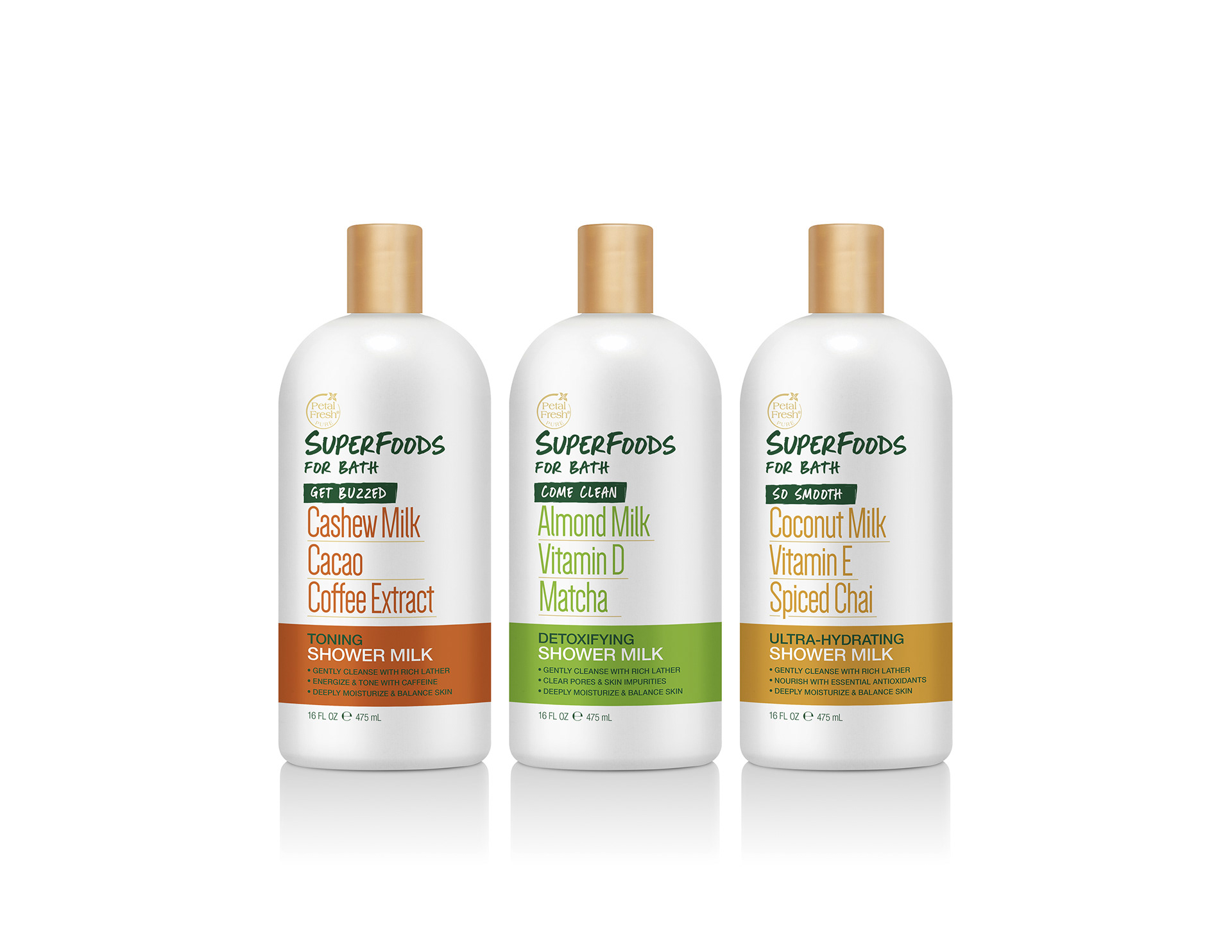
Multi-sub-line packaging systems demand clarity and cohesion. Each sub-line needed its own identity so consumers could navigate the fixture quickly, but the overall line had to read as one unified brand family. The ingredient stories were also complex -- stacking three to four key callouts (Kale + Omega 3 + Keratin, Shea Butter + Vitamin B6 + Argan Oil) without the label feeling like a nutrition panel required deliberate hierarchy decisions.
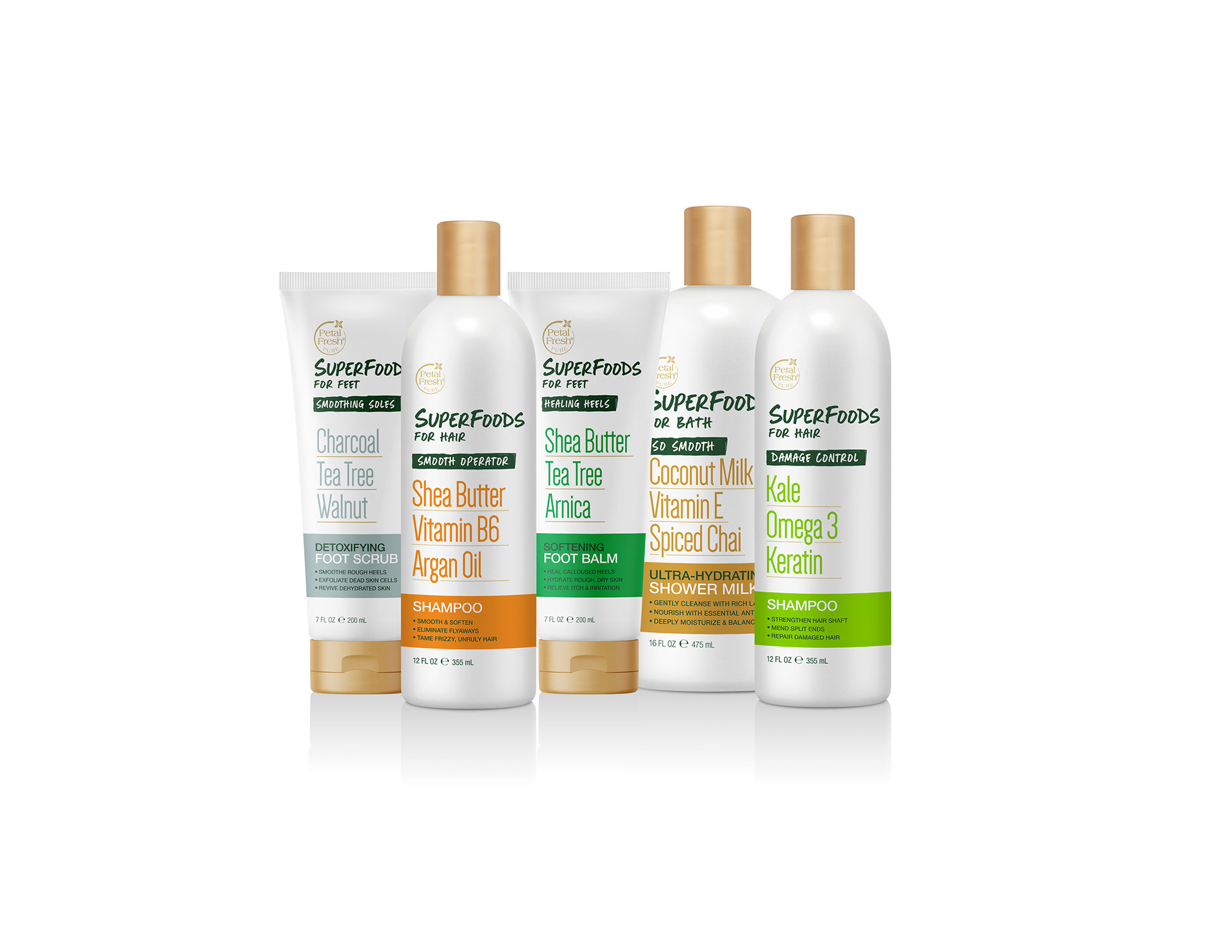
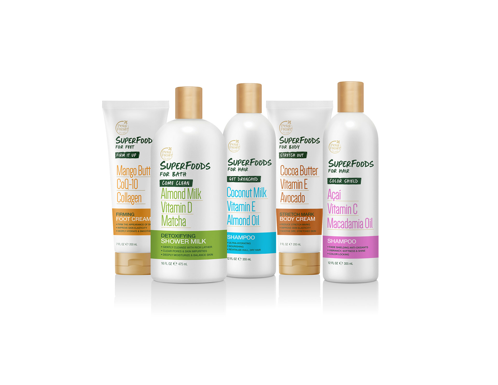
Sub-line naming adds personality without losing function: Damage Control, Get Buzzed, Smooth Operator, Healing Heels. These names do the work of communicating the benefit before the consumer reads a single bullet point. The gold caps unify the full lineup at shelf, giving the line a premium signal that elevates the natural/clean positioning without abandoning accessibility.
The result was the creation of a 14 standout skus that telegraphs trend-forward ingredients and functional benefits within a shelf-ready and scalable design system.